REFINED, REFRESHED, REINVENTED FOR THE WORLD.
Brand Reinvention and Guidelines
Style Guide
Graphic Design
Art Direction
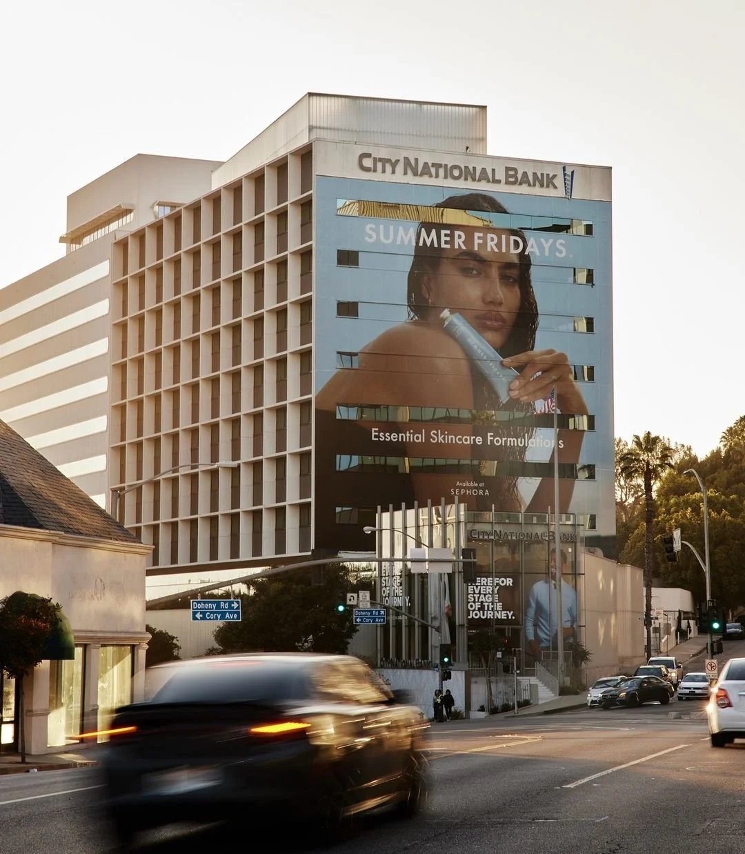
Campaign Creation
Packaging Design
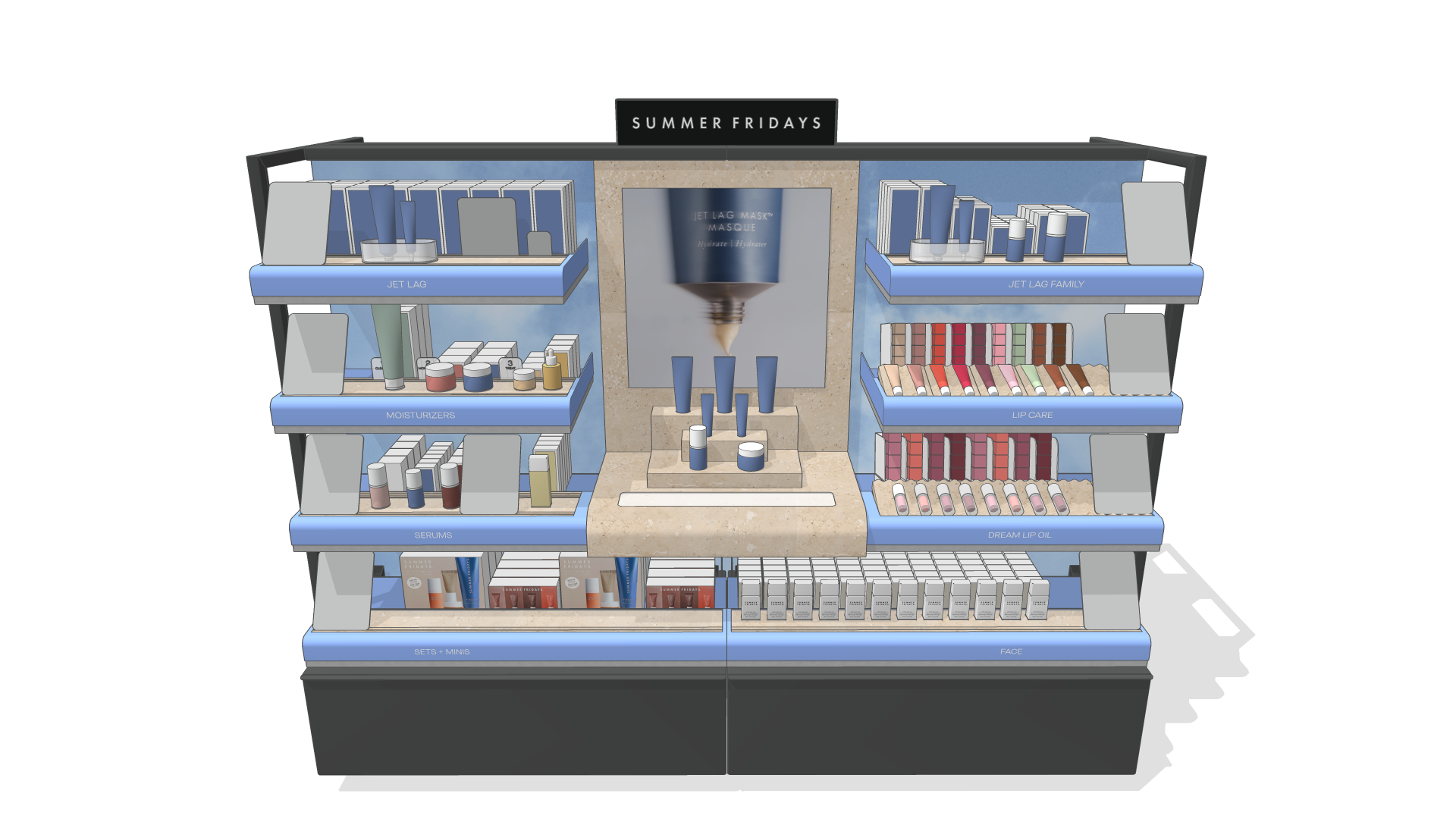
Retail Design
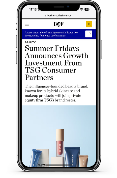
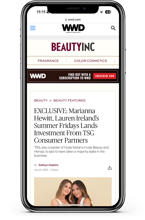
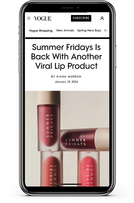
Summer Fridays, a beauty brand founded by Marianna Hewitt and Lauren Ireland, began its journey with the launch of the signature Jet Lag Mask exclusively at Sephora. Originally a viral sensation, since its debut in 2018, the brand rapidly scaled, reaching over $200 million in sales and achieving a valuation well beyond that figure. As new potential investors circled and the customer base matured, Summer Fridays found itself in need of a reimagined brand identity to support its next stage towards global expansion.
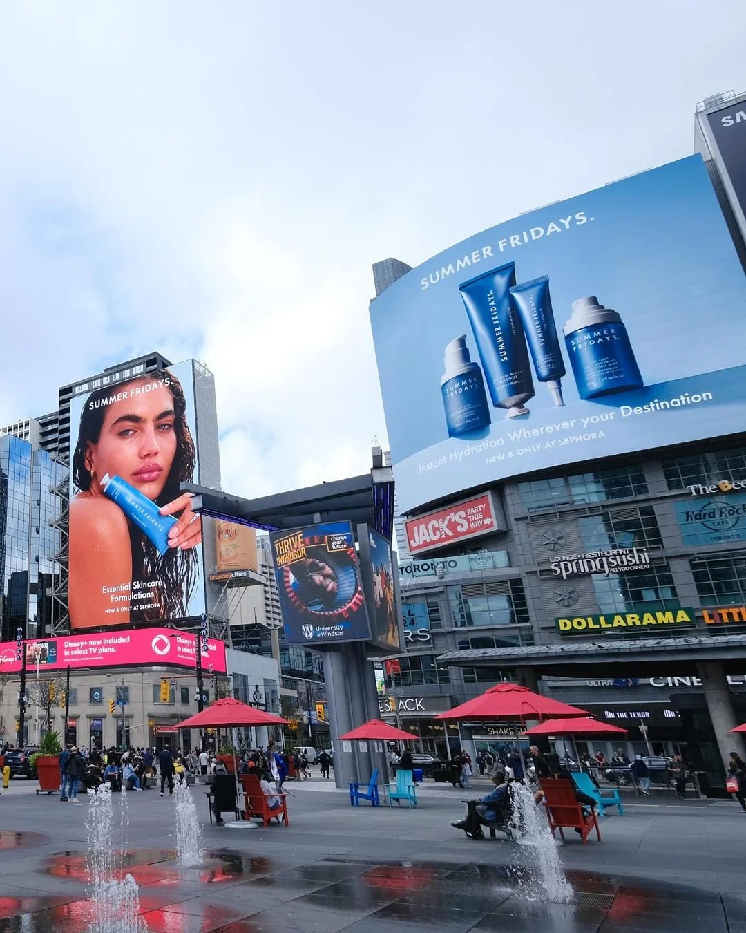
In 2024, the brand approached me with a bold brief that reflected their ambitious vision. The goal was to preserve the brand’s strong presence on TikTok while simultaneously evolving its aesthetic to appeal to a more sophisticated and mature audience. The refresh would encompass a complete overhaul of Summer Fridays’ position, design, art direction, and overall brand aesthetic, ensuring alignment with their expanded investor vision.
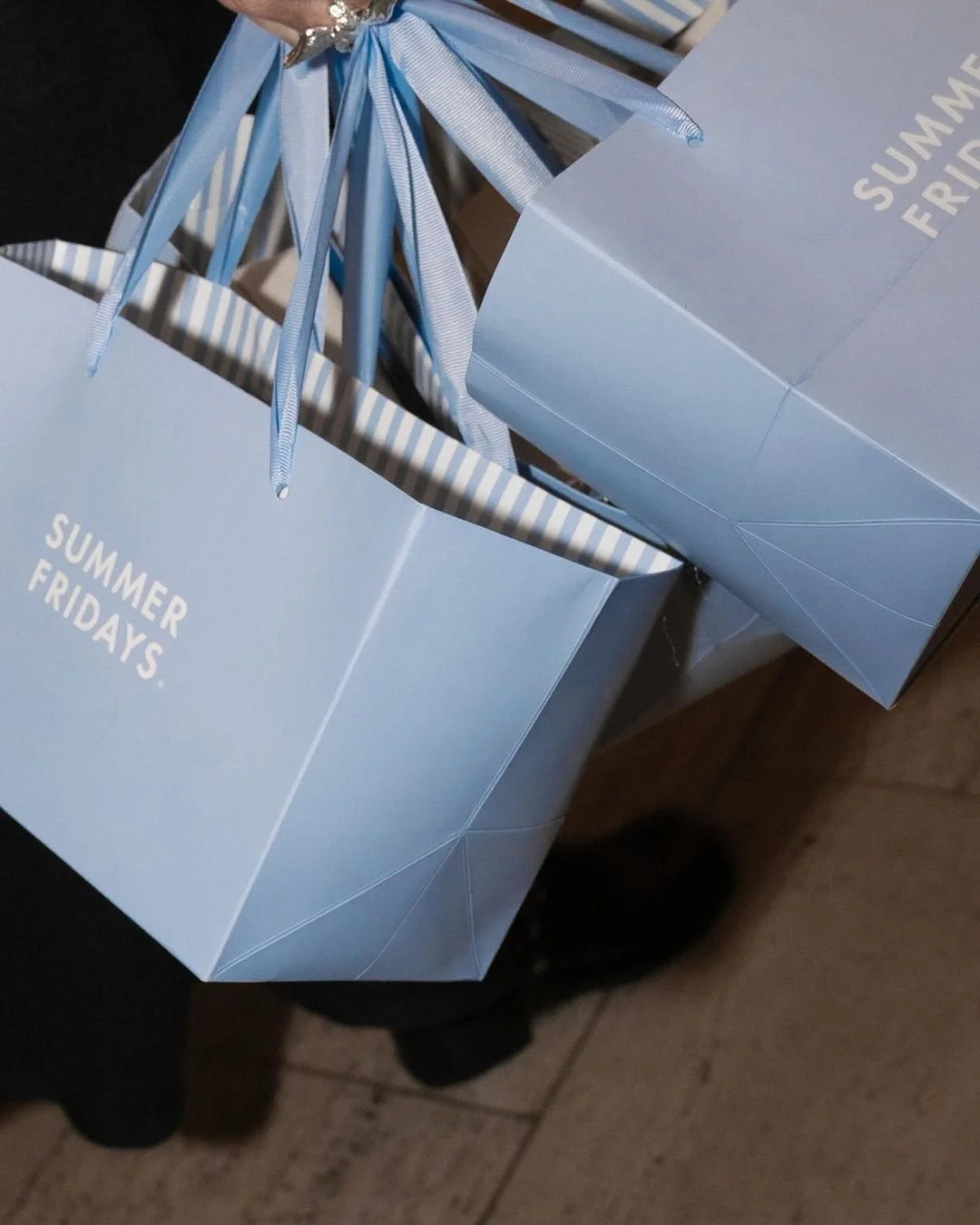
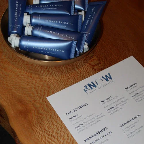
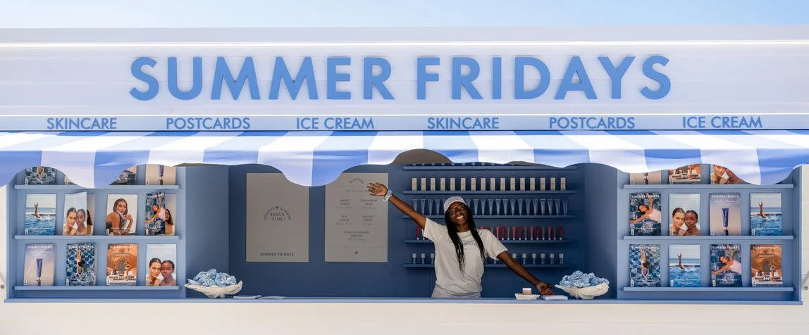
The project called for an updated design aesthetic that balanced youthful energy with a more elevated, refined style. The packaging was completely refreshed, introducing a new color system to enhance the brand’s visual appeal which had prior been called too “candy shop”. The art direction was reimagined with a more sophisticated tone, supported by updated campaign imagery, new taglines, and revised copy guidelines to reflect the brand’s growth. The brand’s presence in Sephora was redefined with new visual merchandising displays, while influencer gifting and shipping boxes were redesigned to enhance customer experience. To complement these efforts, Summer Fridays partnered with King and Partners to develop a new e-commerce site, providing strategic direction and creative support.
This extensive redesign was not just about aesthetics; it was about positioning Summer Fridays as a globally recognized beauty brand that remained true to its roots while stepping confidently into a new chapter of growth and success.
THE BRAND WORLD OF
CALIFORNIA RIVIERA
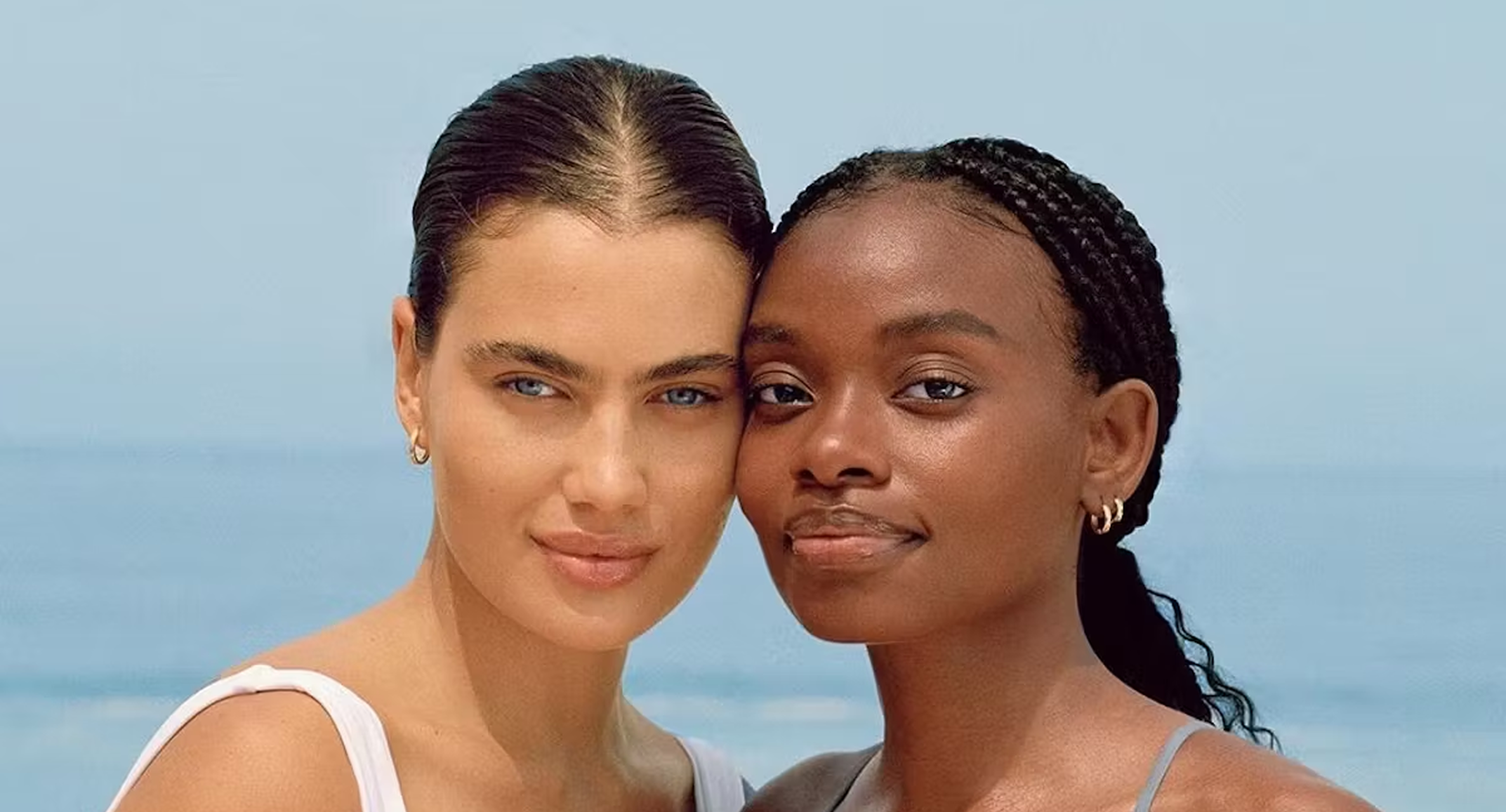
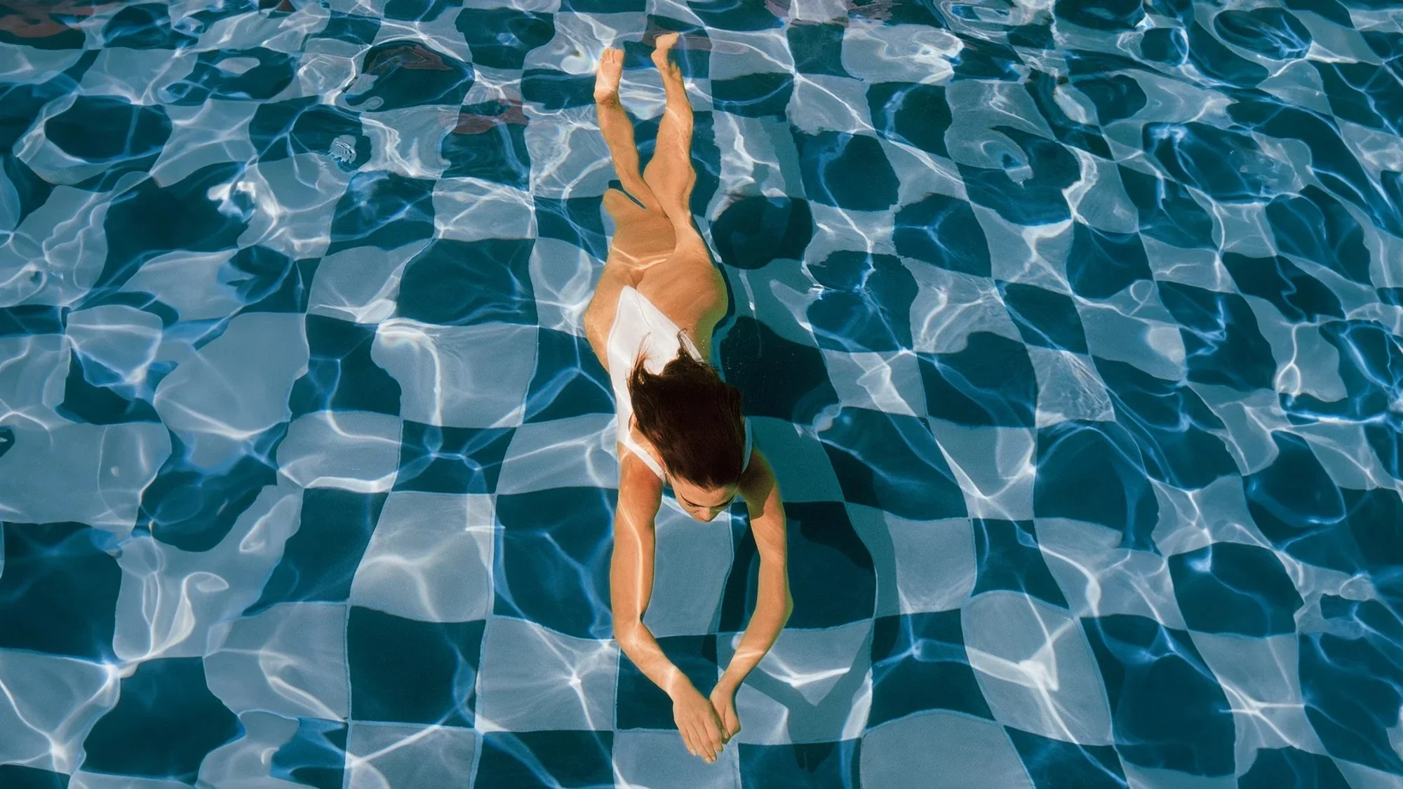
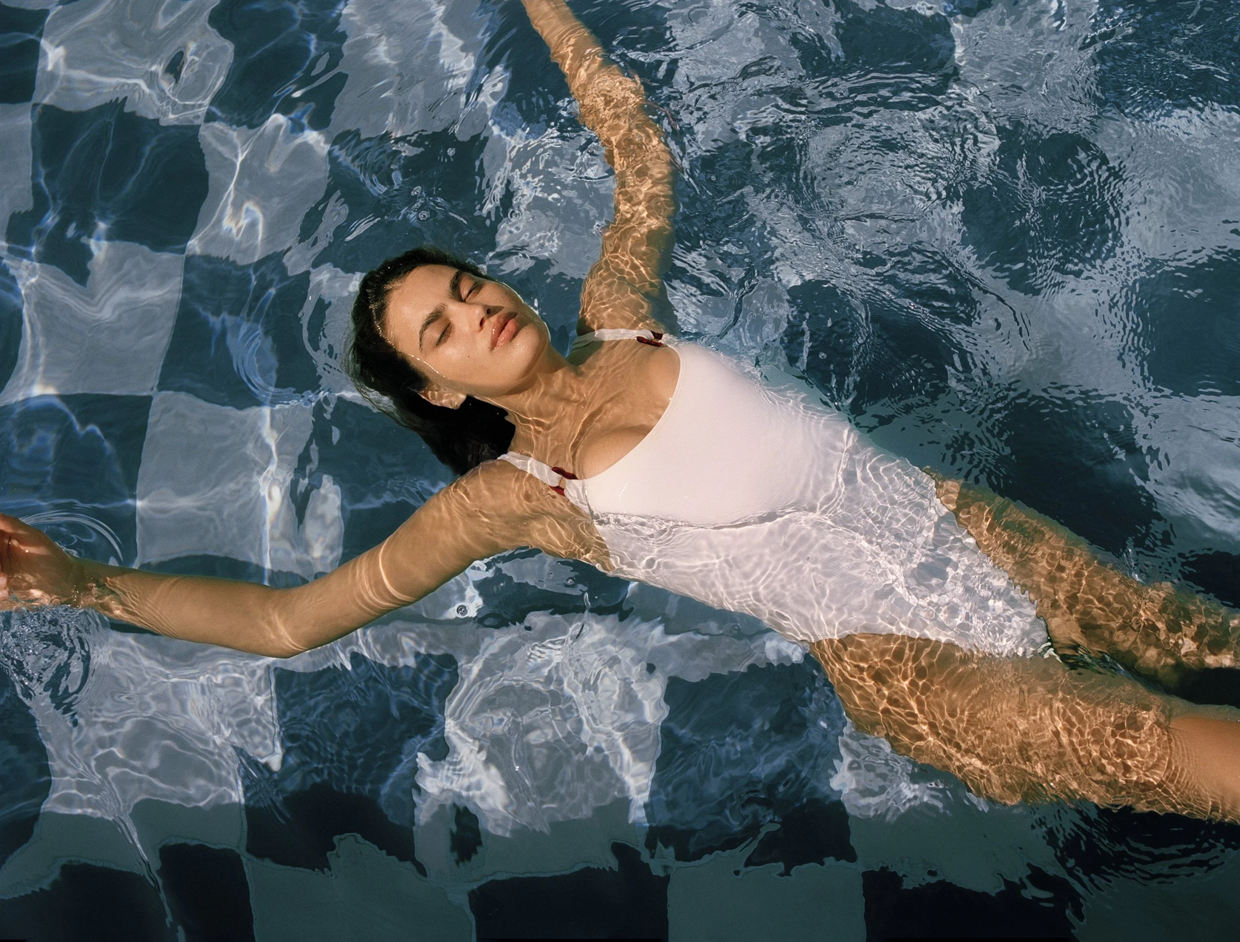
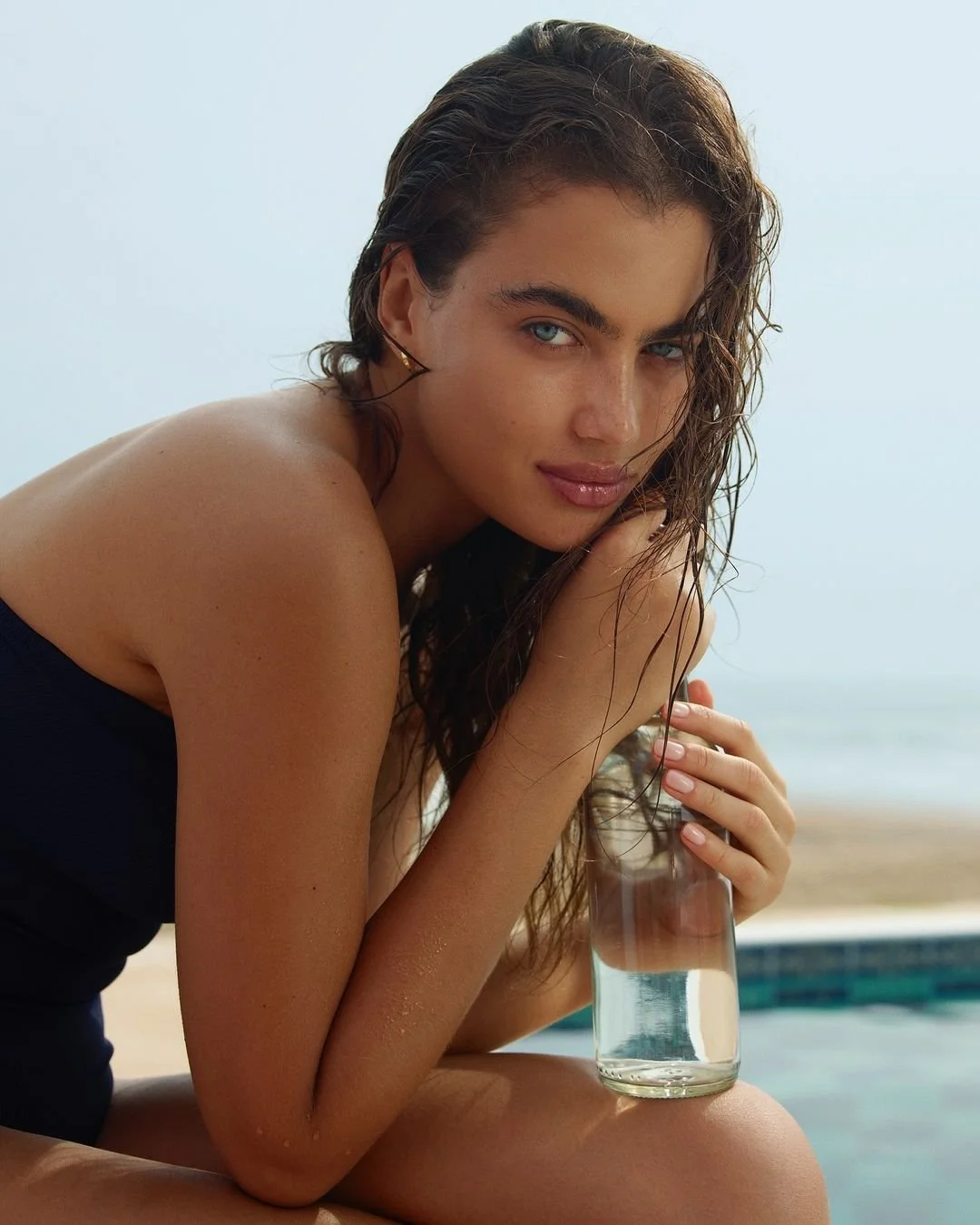
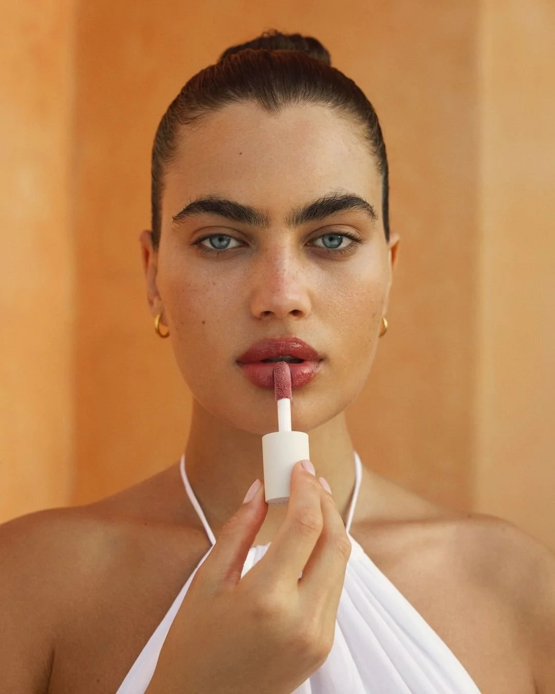
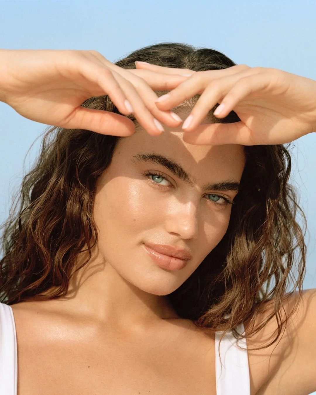
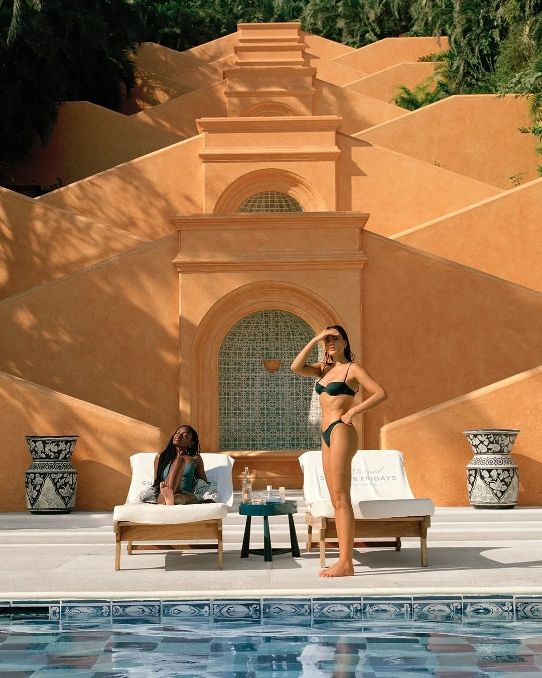
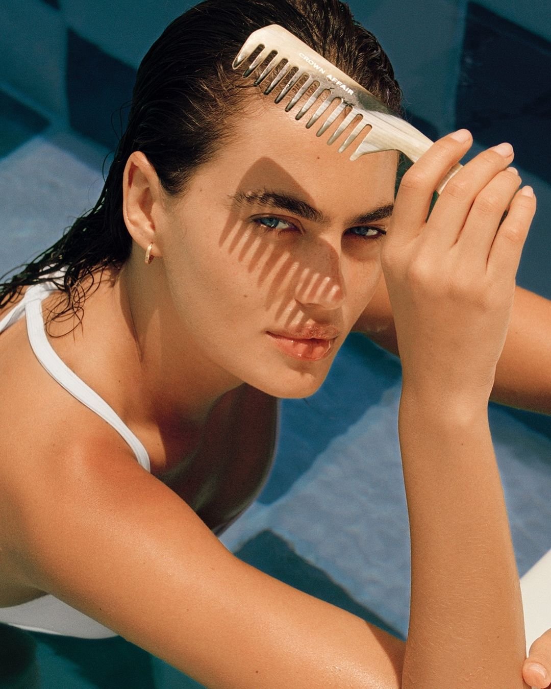
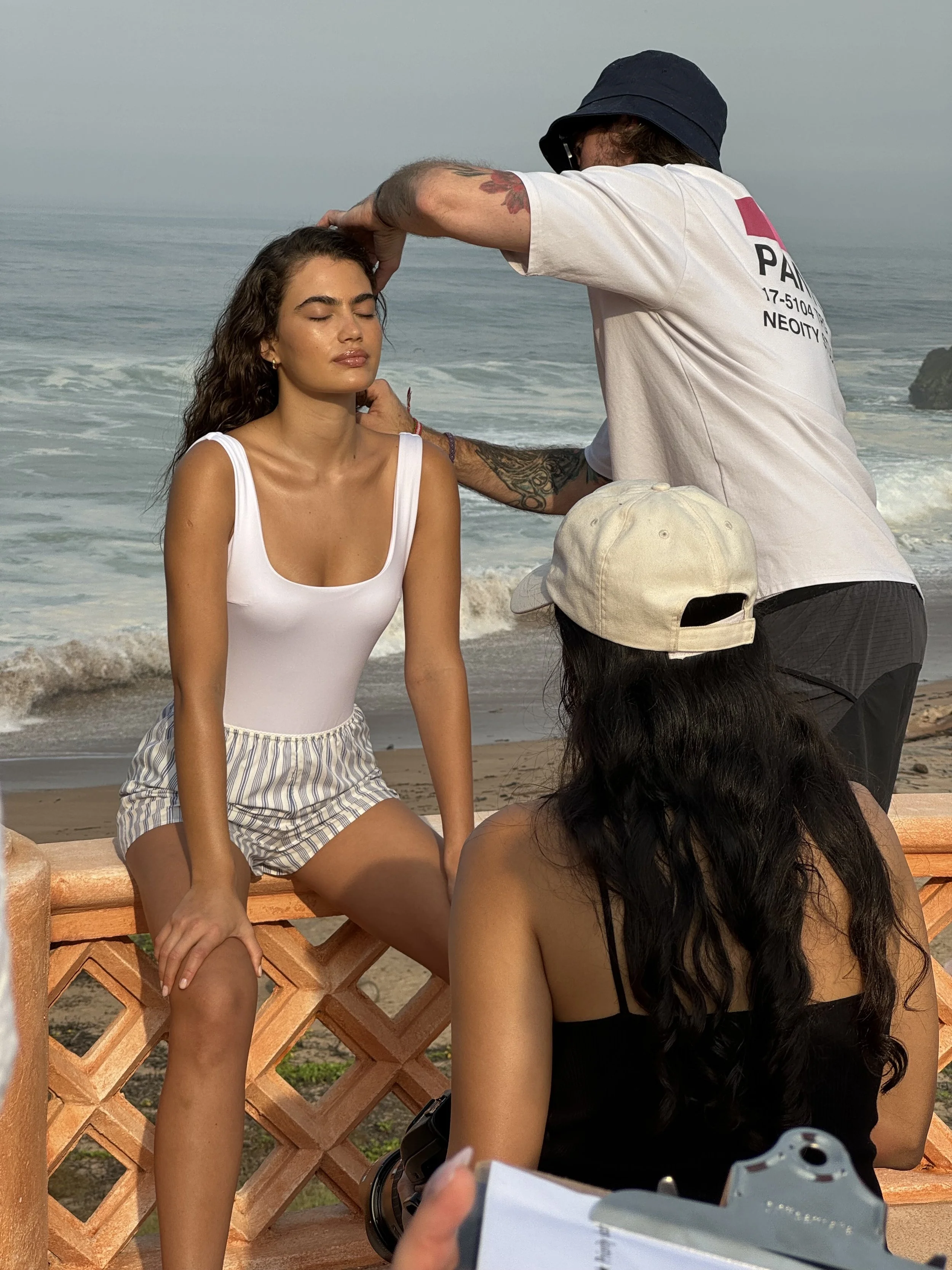
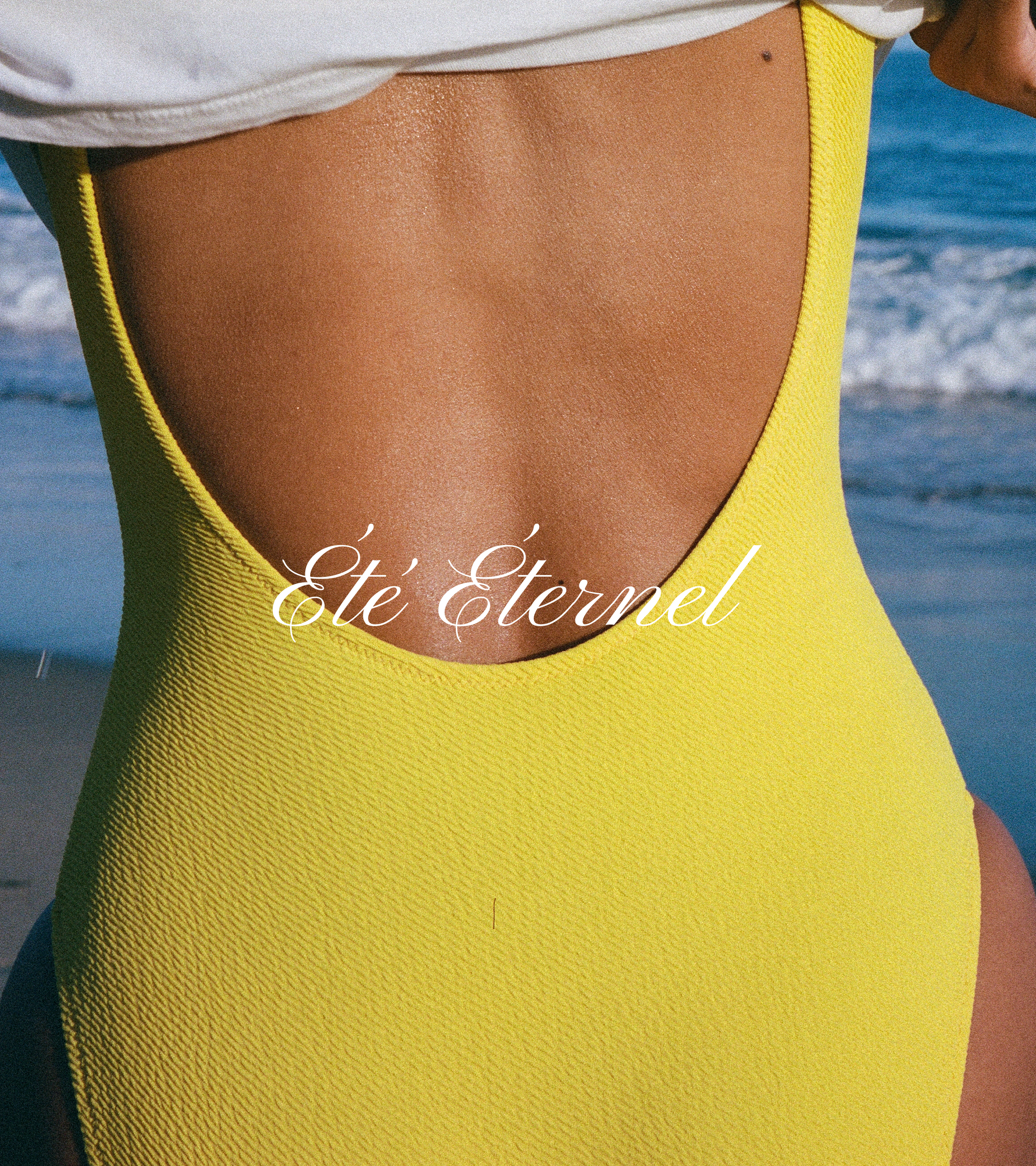
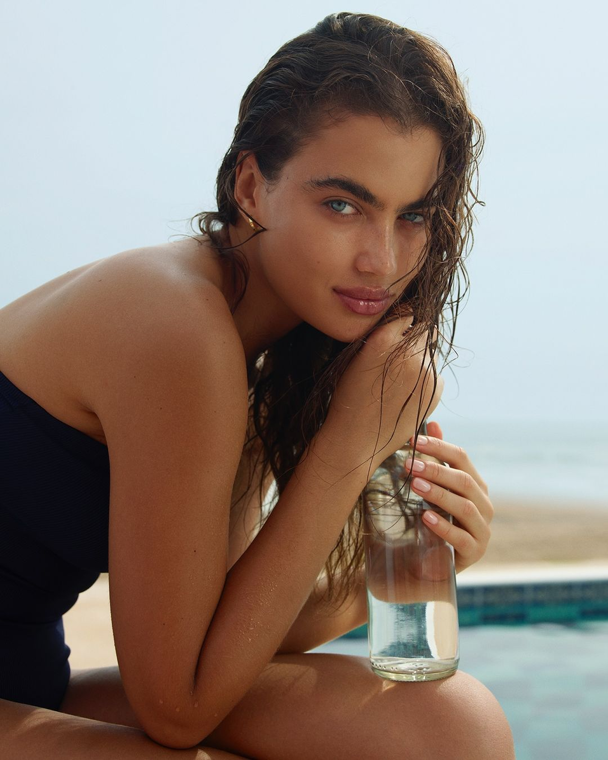
Myself and my team played the pivotal role in reinventing the Summer Fridays' brand design by introducing a new creative philosophy and “brand world” we christened “California Riviera.” This concept blended the timeless sophistication of the French Riviera with the laid-back, sun-soaked charm of California chic, creating a world that exists in the collective psyche. It’s a pastiche of elegance and ease, seamlessly merging the best of Europe and Southern California. Through this vision, we shaped the design, color palette, and art direction to articulate an aspirational world that felt both refined, considered and yet, effortless.
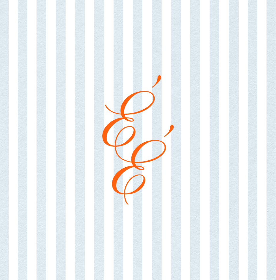
The typography was refined with the introduction of Futura, offering a more simplified and contemporary feel, complemented by a tighter, more cohesive logo treatment. To further capture the essence of the brand, we introduced a secondary wordmark, “L’Été Éternel,” meaning Endless Summer, paired with the elegant Pinyon typeface. This new wordmark helped reinforce the brand’s timeless and aspirational ethos. The expanded color palette was crafted not only to support packaging design and category expansion, but also to extend into secondary and tertiary brand colors, creating a more cohesive visual identity across all touch points.
New brand elements, such as towel stripes and playful icons, were introduced to bring a sense of whimsy and warmth while maintaining the refined aesthetic. Additionally, a flexible brand tagline was developed, consisting of interchangeable parts that could be adapted across multiple product categories, ensuring the brand's message remained consistent yet dynamic.
This evolution of Summer Fridays’ brand design, art direction, and copy was about maturing the brand’s identity to resonate with a growing audience while maintaining the aspirational and effortless charm that made the brand so beloved in the first place.
From candy shop to cohesion.
One of the requests from Summer Fridays was to refine their packaging strategy, moving away from a color palette that had been chosen organically without a clear structure. While this freeform approach was common in a brand’s early years, their rapid growth and category expansion called for a more intentional and sophisticated design system. Internally, the team felt their existing colors gave off a “candy shop” aesthetic that no longer resonated with their evolving customer base.
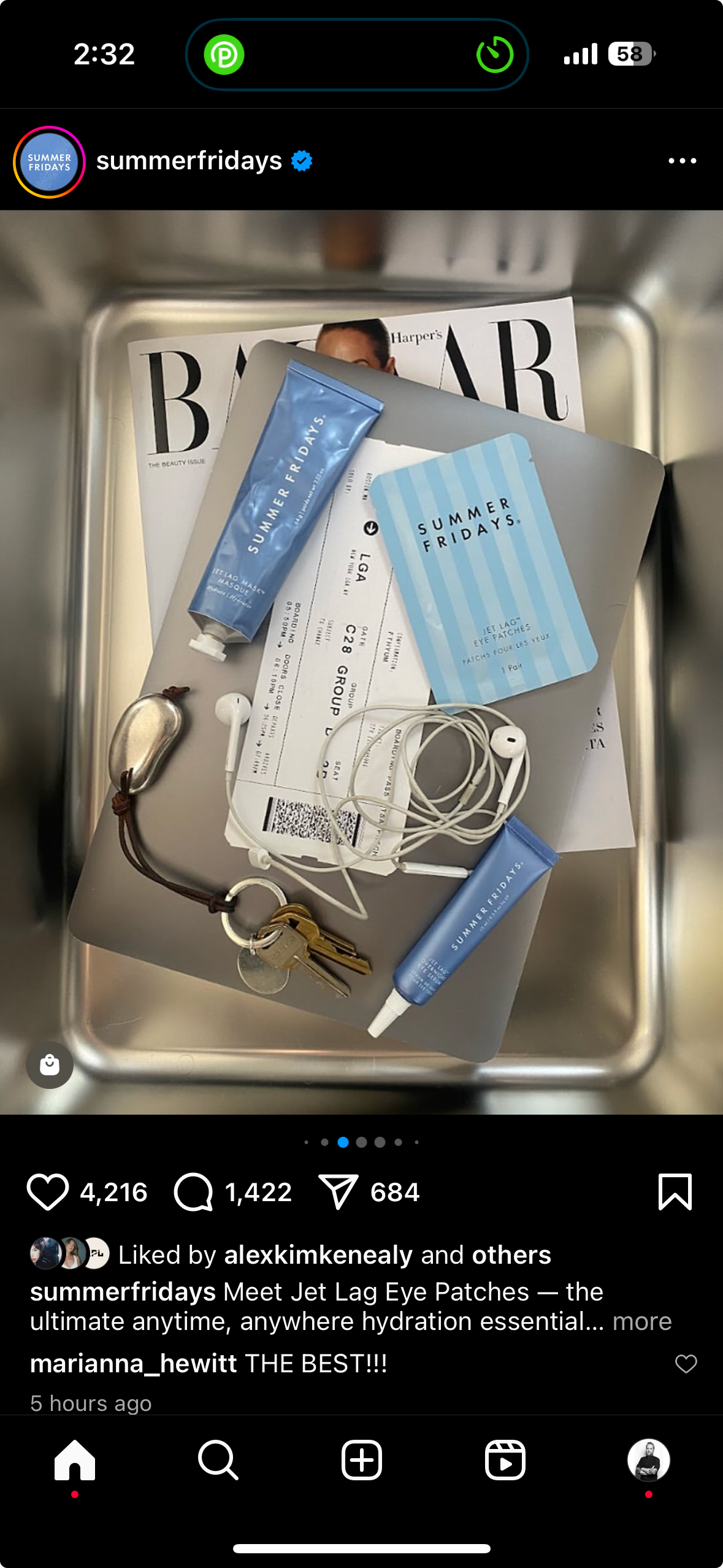
A key priority was establishing Jet Lag Blue as a signature brand color while introducing a secondary and tertiary palette that added vibrancy without sacrificing cohesion. At the same time, rising concerns over dupes meant that while the packaging needed an update, it had to retain enough familiarity to maintain brand recognition and legal protection.
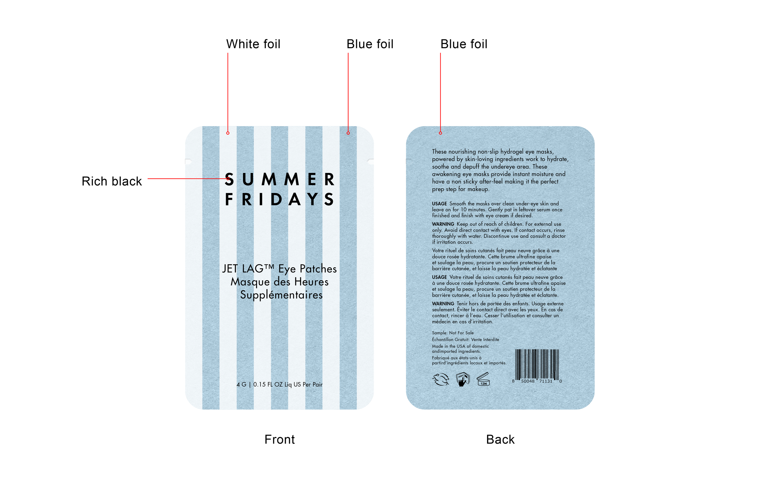
Working within existing templates and alongside packaging suppliers, we removed the inconsistent white borders on select products and expanded Jet Lag Blue into a flexible color family to create continuity across categories. Subtle California Riviera influences, such as delicate stripes and a refined citrus orange accent, were woven into the design to evoke warmth and sophistication. To further unify the brand’s visual language, Été Éternel was embossed across each SKU, adding a signature detail that reinforced Summer Fridays’ identity.
Set to roll out in 2025, the refreshed packaging will debut with the sun care line and Jet Lag Eye Patches, marking the first step in a packaging evolution that blends intentionality with brand heritage.